
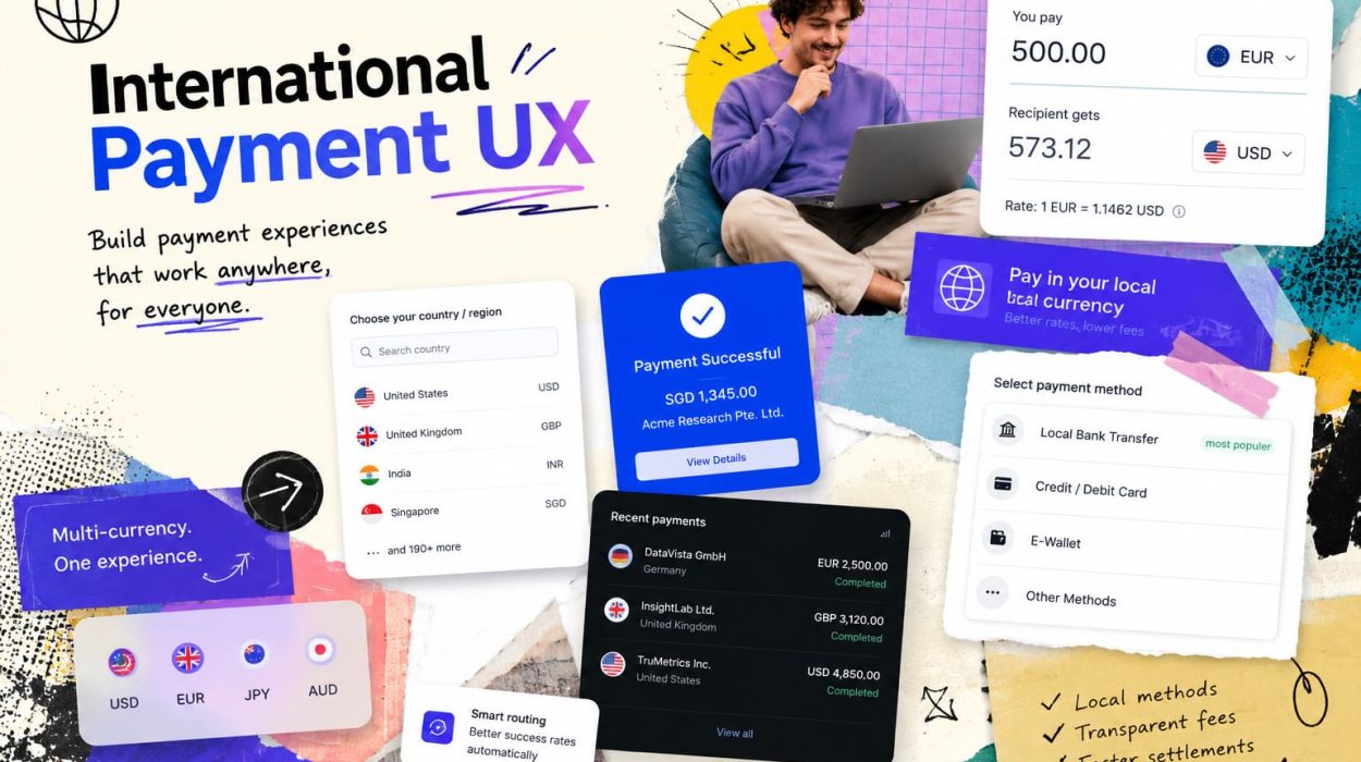
Imagine a customer in Brazil who has spent twenty minutes selecting products from a European online store. They’ve compared options, read reviews, chosen their size. They get to checkout, start filling in their details — and then they stop. The price shown is in euros, but something at the bottom says “amount may vary based on exchange rate.” There’s a foreign transaction fee buried in a tooltip. The only payment options are Visa and Mastercard, but their preferred method is Boleto. They close the tab. The merchant never finds out why. This moment — the hesitation just before payment — is where international payment UX either earns trust or loses it entirely.
Cross-border commerce has grown fast, and with it has come a messy patchwork of checkout experiences that range from seamless to baffling. Some businesses have invested heavily in localization. Others slap a currency converter on their existing checkout and call it done. The gap between those two approaches is visible in every conversion report. Researchers and fintech product teams spend real time studying why users from specific regions abandon at payment, and the answers are rarely about price alone — they’re about clarity, familiarity, and perceived safety.
Users who shop internationally are also increasingly aware of their payment options in a way they weren’t five years ago. Some explore whether they can issue a virtual foreign card to access merchant platforms that restrict certain regions or currencies — a topic that touches on eligibility, bank compliance, and payment processor rules that deserve careful treatment. Others just want to know if their local wallet will work. Both are legitimate questions about payment compatibility, and both point to the same underlying challenge: international payment UX is about more than language. It is about aligning what the user expects with what the checkout actually delivers.
This article looks at the practical mechanics of international payment UX — localization details, currency display logic, payment method expectations, error messaging, trust signals, and compliance-aware design — with the goal of giving product teams, developers, and writers a clearer picture of where global checkouts go wrong and how to make them work better.
Why Payment UX Matters
The checkout page is not just a form. It is the moment when a user decides whether they trust a merchant enough to hand over money. Every design decision at that stage — the layout, the labels, the currency shown, the payment options available — either reinforces or erodes that trust. For domestic users buying from familiar merchants, the checkout is mostly friction management. For international users, it carries an additional layer of uncertainty: Is this price final? Will my card work? Will there be hidden fees? What happens if something goes wrong?
The Baymard Institute’s checkout research consistently shows that hidden or unexpected costs are the single biggest reason for cart abandonment. That finding hits harder for international buyers, who may face both the original merchant fees and a layer of cross-border costs they didn’t anticipate — foreign transaction charges from their own bank, currency conversion markups, or processing fees they weren’t told about. By the time those appear, the user’s confidence is already gone. Rebuilding it at that point is nearly impossible.
There is also a quieter problem: the checkout that technically works but feels wrong. A user from Japan entering their name in the Western order (given name first) when their habit is family name first. A German user seeing a date formatted as 04/05/2025 and not knowing if that’s April or May. Small friction. Real hesitation. And hesitation, at the payment stage, tends to end in abandonment rather than patience.
Localization Is More Than Language
Translating a checkout page into another language is a baseline, not a solution. Real localization means every data field, every label, every piece of legal text fits the user’s actual context — not just their language. A checkout localized only at the language level will still confuse users if address fields expect a US ZIP code, phone numbers have the wrong format, or tax labels don’t match what the user’s country calls that tax.

The details that affect checkout trust go deep. When a user sees a form that asks for their “State” when they live in a country that has provinces, or asks for a billing address that doesn’t allow enough characters for their actual address, that friction signals that the merchant didn’t design this experience for them. That’s a trust signal — a negative one.
- Date format: MM/DD/YYYY creates genuine confusion in countries that use DD/MM/YYYY — and that’s most of the world outside the US
- Name order: East Asian naming conventions (family name first) differ from Western convention; forms that force Western order feel disrespectful or broken
- Address structure: Postal code placement, province vs. state vs. county, and line-length limits all vary significantly by country
- Phone number format: Country code input, digit grouping, and validation regex must reflect the target market
- Tax labels: VAT, GST, HST, consumption tax — same concept, different names; using the wrong one creates confusion about whether it’s the correct charge
- Legal text and consent: GDPR-compliant wording for EU users, different disclosure requirements elsewhere; copy-pasting legal text across regions creates compliance gaps
- Currency symbol placement: Some currencies place the symbol after the number; reversing this looks like an error to native users
- Character input support: Full Unicode support for names, addresses, and notes — essential in markets with non-Latin scripts
- Honorifics and titles: Required in some markets, unnecessary in others; forcing them where they’re not used, or omitting them where they’re expected, both cause friction
- Right-to-left layout: Arabic and Hebrew markets require RTL layout that goes beyond text direction to include field order, icon placement, and button positioning
Currency Display
Currency display is one of the most mishandled areas in international checkout. The core tension is between what the merchant wants to settle in and what the user wants to understand. A merchant in Germany wants to collect euros. A buyer in Canada wants to know what they’re spending in Canadian dollars. Those two things are not automatically the same, and the checkout design has to bridge that gap without creating confusion or eroding trust.

The most important principle is final price clarity before payment submission. If the user sees one number on the product page, a different number in the cart, and yet another on the bank statement, trust collapses — even if all three numbers are technically correct representations of the same transaction at different stages of conversion. Showing both the merchant currency and the user’s local currency, with a clear conversion note, is far better than showing only one and letting the user discover the discrepancy at the bank.
Currency symbols are a specific trap. The dollar sign ($) is shared by the US, Canada, Australia, Singapore, and many others. A user from Singapore seeing “$120” is entitled to wonder: which dollar? The same issue applies to the franc, the pound, and several other symbols. Always pair the symbol with the ISO currency code (USD, CAD, AUD, SGD) when there’s any chance of ambiguity. It takes three extra characters and prevents a lot of confusion.
| Currency Issue | User Reaction | Better UX Approach | Common Mistake |
|---|---|---|---|
| Price shown in merchant currency only | User doesn’t know what they’ll actually pay | Show local equivalent with conversion note | Leaving conversion to the user’s bank statement |
| Ambiguous currency symbol (e.g., “$”) | User assumes their local currency and is surprised later | Pair symbol with ISO code (USD, CAD, AUD) | Using “$” globally without clarification |
| Rate shown at cart, price changes at payment | User feels deceived even if the change is small | Lock displayed rate or explain rate-freshness clearly | Live rate refresh without user notice |
| Rounding inconsistencies across pages | User suspects a calculation error or hidden fee | Consistent rounding logic, disclosed at first display | Different rounding on cart vs. confirmation page |
Fees, Taxes, and Final Price
Nothing kills checkout confidence faster than a price that changes between the product page and the payment confirmation. A user who sees $49.99 on a product page and encounters $61.40 at checkout — even if every added charge is legitimate — experiences that gap as a form of manipulation. The problem is not the fees themselves. It’s that they were hidden until the last moment.
Final price clarity should come before the user enters any payment details. Taxes, processing fees, cross-border fees, shipping, and any currency conversion markup should all be itemized and visible before the payment step begins. The Baymard Institute’s checkout usability research has documented this repeatedly: users who see a clear, itemized total before payment submit with more confidence and generate fewer chargebacks and support queries than users surprised by a total they didn’t expect.
For international buyers specifically, there’s often an additional layer: their own bank may add a foreign transaction fee on top of whatever the merchant charges. That’s outside the merchant’s control, but it’s worth acknowledging in a brief note near the total — something like “Your bank may apply additional conversion or foreign transaction fees.” It’s a small acknowledgment that sets honest expectations and deflects some of the frustration when users see a slightly higher charge on their statement.
Payment Method Expectations
Payment method preference varies enormously by market. Cards dominate in some countries, but in others — Germany, the Netherlands, China, Brazil — local methods like SEPA transfers, iDEAL, Alipay, and Pix have majority usage. A checkout that offers only Visa and Mastercard is, in many markets, a checkout that excludes a significant portion of potential buyers. The assumption that “card is universal” is a product decision with real conversion consequences.

Beyond availability, the order in which payment methods are presented matters. Leading with an unfamiliar method signals that the experience wasn’t designed for the user’s context. A Dutch buyer who has to scroll past Apple Pay, Google Pay, and five card options to find iDEAL is less likely to complete the payment than one who sees iDEAL near the top. Localized method ordering, based on market research or geo-detection, is a meaningful UX improvement.
- Recognized payment logos reduce hesitation — seeing a familiar badge is reassuring before entering details
- Wallet buttons (Apple Pay, Google Pay) should appear prominently on mobile, where they eliminate form entry entirely
- Buy-now-pay-later options are expected in some markets (Klarna in Sweden, Afterpay in Australia) and nearly unknown in others
- Bank transfer is a primary method in Germany, the Netherlands, and much of Southeast Asia — not a fallback
- QR code payments are mainstream in China, India, and parts of Africa — mobile-first checkout must account for them
- Real-time payments (UPI in India, Pix in Brazil) are often preferred for their instant confirmation
- Card type labeling matters: “credit card” and “debit card” have different connotations and acceptance rules in different markets
Cards and Virtual Cards
Cards remain central to international payment, but they carry more complexity than they appear to. Merchant acceptance depends on the card network, the issuing country, the merchant’s payment processor, and the specific BIN (bank identification number) range. A card that works perfectly for domestic purchases may be declined by a foreign merchant’s processor because of risk rules, currency restrictions, or issuer-side international spending blocks — blocks that many banks apply by default and that users have to consciously turn off.
Virtual cards add another dimension. They’re widely used for subscription management, travel bookings, and privacy-conscious purchases. Merchants who accept virtual cards should ensure their checkout doesn’t flag them as fraud vectors based purely on BIN characteristics. Legitimate virtual cards issued by major banks and fintech platforms pass standard fraud checks, but some merchant-side fraud rules are overly aggressive about non-standard BIN ranges. That results in real, legitimate transactions being declined — frustrating users who did nothing wrong.
Billing address validation is a frequent pain point for international card users. Many merchants run AVS (Address Verification System) checks designed for US addresses, and those checks can fail or return partial matches for international billing addresses that are structured differently. When AVS fails, some merchants auto-decline the transaction. That’s a conversion loss and a support burden. Better design either removes strict AVS requirements for non-US markets or applies softer validation logic that accounts for address format differences globally.
Cross-Border Compliance
When a user wants to pay internationally — or use a financial product from another country — the compliance layer becomes relevant quickly. Foreign cards, cross-border payment accounts, and international banking products all operate within frameworks that include KYC (Know Your Customer) verification, AML (Anti-Money Laundering) screening, sanctions checks, and local regulatory requirements. These aren’t bureaucratic obstacles; they’re the mechanisms that keep the payment system trustworthy and functional for everyone.
Product teams designing for cross-border payment flows should understand that eligibility for foreign financial products is determined by law and by the terms of the issuing institution — not by UX design choices. A merchant that accepts foreign cards is not responsible for verifying that the user is eligible to hold that card. But a platform that helps users access financial products has a responsibility to present eligibility, documentation, and compliance requirements honestly.
Users sometimes search for topics like how to apply for a virtual card of a foreign bank — and that’s a legitimate research question about whether they qualify, what documentation is required, and which banks or platforms serve their jurisdiction legally. The correct answer is always grounded in legal eligibility, the institution’s own onboarding requirements, applicable sanctions lists, and the user’s own tax and accounting obligations. Anyone building informational content or product flows around this topic should point users clearly to official bank documentation and legal advice rather than implying that workarounds exist. They rarely do, and the ones that appear to often cross lines that carry real consequences.
Failed Payment Messages
A failed payment is stressful. The user has committed to buying something, entered their details, and hit submit — and now something has gone wrong. What happens next determines whether they try again or leave. Most failed payment messages are terrible. They’re vague (“Your payment could not be processed”), they don’t explain what happened, and they often feel like the merchant is blaming the user for something that may have been entirely outside their control.
Useful decline messages explain what category of problem occurred and give the user a concrete next step. “Your card was declined — please check the card number and expiry date” is more useful than “Payment failed.” “Your bank declined this transaction — please contact your bank or try a different card” is honest and actionable. It won’t solve every problem, but it reduces the feeling that the user did something wrong and gives them somewhere to go.
| Error Message Problem | What the User Thinks | Better Message Style | Support Benefit |
|---|---|---|---|
| “Payment failed” with no detail | “Did I enter my details wrong? Is the site broken?” | State the decline category (card error, bank decline, network issue) | Fewer “what happened?” tickets |
| “Your card was declined” with no guidance | “My card is broken or I’m being flagged as fraud” | Suggest trying a different card or contacting the bank | Higher retry rate, lower frustration |
| Technical error code shown to user | “This site is broken and I don’t know what this means” | Log the code internally; show plain-language guidance to user | Cleaner support queue, no “error 4301” tickets |
| No retry option offered | “I have to start over — this isn’t worth it” | Keep cart state, offer payment method alternatives inline | Significantly higher post-decline recovery rate |
Trust Signals at Checkout
International buyers arrive at checkout with a higher baseline of skepticism than domestic buyers. They’re entering payment details on a site that may be less familiar, in a currency they’re computing mentally, through a process they haven’t done with this merchant before. Trust signals are not decoration — they are functional parts of the conversion experience.
The most effective trust signals are honest and specific. A padlock icon next to the payment form is expected — its absence is noticed, but its presence barely registers. What registers more: a clear refund policy linked near the payment button, a recognizable payment network logo (Visa, Mastercard, PayPal), a brief and plain-language statement about how payment data is handled, and a visible support contact. The PCI Security Standards Council provides merchant guidance on payment data security that underpins many of these trust practices — merchants operating at the right compliance tier can reference that credibly.
What doesn’t work: fake review counts, vague “bank-level security” claims with no detail, stock photo trust seals that link nowhere. Users who are cautious about a foreign merchant will click those seals. When they lead to nothing, it makes things worse. Be specific or say nothing.
Mobile Payment UX
More than half of international ecommerce happens on mobile — and mobile checkout has a distinct set of failure modes. Keyboards that don’t switch to numeric mode for card number entry. Buttons that sit too close to the edge for comfortable tapping. Forms that reset when the user switches apps to check their card number. These problems are fixable, and fixing them has a measurable impact on completion rates.
Wallet integrations (Apple Pay, Google Pay, and local equivalents) are particularly valuable on mobile because they remove the manual form entry entirely. A single biometric confirmation replacing sixteen form fields is a dramatic UX improvement. Merchants who haven’t implemented wallet payment options on mobile are leaving easy conversion on the table.
- Use
inputmode="numeric"ortype="tel"for card number and CVV fields so the numeric keyboard appears automatically - Place the primary payment button within thumb reach — bottom-center or bottom-right on most screens
- Autofill support for saved addresses and card details should be fully enabled, not accidentally blocked
- Loading states must be clearly visible after payment submission — silence after a tap creates anxiety and double-submits
- Confirmation screens need to load fast and be clear: amount, currency, merchant name, and a reference number
- Wallet buttons (Apple Pay, Google Pay) should appear before the card form, not buried below it
- Session timeout should warn users before it expires mid-form — losing progress on mobile is especially frustrating
- Error states should highlight the specific field that needs fixing, not just scroll to the top of a long form
- OTP (one-time password) flows for 3DS authentication should integrate smoothly with autofill on iOS and Android
Designing for Global Teams
Good international payment UX doesn’t come from one team working alone. It emerges from product, engineering, finance, legal, support, and localization working from a shared understanding of what the user encounters and why it matters. In practice, those teams often operate in silos — engineering owns the checkout form, finance owns the pricing logic, legal owns the disclosure text — and nobody owns the overall user experience of paying internationally.
Ownership gaps show up in the UX. The pricing copy that finance approves may not account for how it reads in another language. The legal disclosure that the compliance team requires may break the layout in a right-to-left locale. The support team hears about payment failures that engineering never sees because they’re logged as “processor declines” and considered closed. Building regular cross-team review of the international checkout — not just a one-time localization project — is what keeps these problems from silently compounding.
Common Mistakes
Some payment UX problems are dramatic — wrong currency, broken form, payment timeout. Others are quiet. They don’t cause immediate failure; they accumulate into a checkout that feels slightly off, slightly untrustworthy, slightly more work than it should be. Those quiet problems are often harder to catch and fix.
- Auto-detecting location incorrectly and showing the wrong currency or address format to users behind VPNs or with unusual IP routing
- Hiding conversion fees in the exchange rate markup rather than disclosing them as a line item — technically legal in some markets, but corrosive to trust
- Using ambiguous currency symbols without ISO codes, leading to genuine confusion about which dollar, franc, or pound is being charged
- Forcing unfamiliar payment methods by not geo-adapting the method list, causing users to abandon rather than use an option they don’t recognize
- Unclear billing descriptors that don’t match the merchant name the user knows, triggering “I don’t recognize this charge” disputes
- Weak decline messages that don’t tell users what went wrong or what to do next
- No localized support path — a contact form in English only, with no phone number or chat option, leaves international users with nowhere to turn when something fails
- Ignoring 3DS friction on international cards, where strong authentication flows are longer and more likely to be abandoned without clear UX support
A Practical Review Checklist
Before launching or updating an international checkout, a structured review across the key areas reduces the chance of missing something that will matter to users in specific markets. The table below gives a starting framework — not exhaustive, but enough to surface the most common failure points.
| UX Area | What to Check | Who Owns It | How Often |
|---|---|---|---|
| Currency display | Correct symbol + ISO code, final total matches pre-payment shown amount | Product / Engineering | Each new market launch + quarterly |
| Localization | Address fields, date formats, tax labels, name order, RTL support | Localization / Product | Each locale launch + after UX changes |
| Payment methods | Local methods available, correctly ordered, logos displayed | Product / Payments | Quarterly per market |
| Fee transparency | All fees itemized before payment step, cross-border note included | Finance / Product | Any time pricing logic changes |
| Error messages | Plain language, category-specific, next step offered | Engineering / Support | After any processor or gateway change |
| Trust signals | Security statement, refund policy, support contact visible | Product / Legal | Annual + after any redesign |
| Mobile UX | Correct keyboard types, wallet buttons, thumb-reach layout | Engineering / Design | Each platform update |
Conclusion
International payment UX works when users understand — before they submit — what they are paying, in what currency, through which method, and what happens if something goes wrong. That clarity is not a luxury feature. It is the minimum standard for a checkout that treats international buyers with the same respect as domestic ones. Every piece of localization detail, every transparent fee line, every sensible error message contributes to a user experience that either earns trust or quietly destroys it.
Poor localization doesn’t just produce friction. It signals to the user that the merchant didn’t think about them specifically. And for international buyers, who are already navigating the uncertainty of a foreign checkout, that signal lands hard. Good payment UX in a global context is the absence of unwelcome surprises — currency surprises, fee surprises, method surprises, and the very worst kind, the surprise of a payment failing with no explanation.
The best international checkout isn’t the one with the most features — it’s the one where the user never has to wonder what just happened.